
Just a few decades ago, it was unfathomable to think that socialism would gain a significant foothold in the United States. But events in recent years have shown us that this ideology, once widely rejected by Americans, is now at the country’s doorstep—and rising in popularity.
Today’s socialists are in agreement that in order to promote fairness and justice, wealth must be redistributed. While specifics differ, policies like “Medicare for All,” “Free College,” “Universal Basic Income,” and higher taxes on successful entrepreneurs are usually included in this socialist scheme.
One of the most destructive results of socialism is the destabilization of the incentive structure in the economy—which is usually the mechanism that keeps prices low, quality high and promotes the efficient use of resources. The below chart, developed by Nobel Prize-winning economist Milton Friedman, graphically demonstrates this relationship.
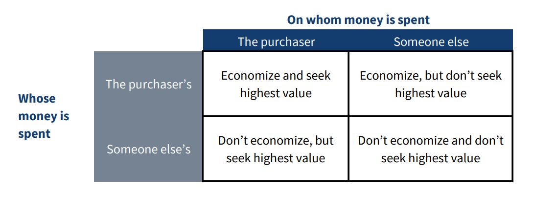
The free market economic structure falls into the upper left corner of the chart, showing that in a system where someone’s money is spent on themselves, incentive mechanisms ensure the value of the money is maximized.
In contrast, the bottom right corner of the chart illustrates socialism—which leads to an inefficient use of funds. Or in other words, because people’s money is being spent on other people, it’s impossible to know how to use it correctly.
Margaret Thatcher once said the problem with socialism is “they always run out of other people’s money.” The very opposite is true about the free market structure—a system that empowers people to create their own wealth, rather than taking from others.
In short, the free market has turned America into the most prosperous country the world has ever known—socialism threatens to undo that progress.